The Good, The Bad and the E-GUI
TM
This paper shall demonstrate how recent developments in technology are about to completely alter they way we think about our work. These converging technological revolutions come from diverse and unrelated backgrounds. The battleground where these converging changes will meet is the desktop. The PC that we all use today is the battle-ground whereby fundamental changes to the way we work are about to break. And it is not Bill Gates who is managing this particular change!
Microsoft is attempting to manage some component of the IT revolution. Backoffice support, Internet, Object Linking and Embedding (OLE) and so on are merely sub-components. What we are focusing on in this white paper is the user interface. The user interface transcends Microsoft, although Xerox and perhaps Apple pioneered it and Microsoft popularized the Windows interface back in the 1980’s. This paper will review how the user interface has changed in the last 15 years. It will conclude by highlighting the key issues in user interface design, and describing a road map that demonstrates the tremendous shift that is taking place today in this area. The impacts are far reaching. What we do today at work, how we do it, and why we do it, are all going to change. The user interface is fundamental in how we, as humans, communicate with everything else that is not human.
The Dark Ages…How it all began
In 1980 personal computers (PC’s) were typically used by accountants to evaluate budgets and analyze finances. That was their limited role in life. Lotus’s 1-2-3 spreadsheet was the market - the industry standard - since it was first major PC spreadsheet that received widespread demand. The typical PC (and their very presence in the business environment was not typical) was a green screen, 20 megabyte hard drive machine, with 640K memory. The PC sat on a corner of a spare desk somewhere in the accounting office. Sometime later, nervous bosses began to move the PC to there enlarged desk.
In terms of operating systems, the market for PC’s was dominated by DOS. There were various flavors of DOS, but all utilized a character-based interface. Commands were given to the PC by typing in words (some of them meaningful) at a command line. Early spreadsheets did not use a mouse. Today that is hard to imagine, but it was true.
Also in 1980 most medium or large enterprises, at least in the Western world, were in the midst of either implementing their first, or re-implementing their second, Manufacturing Resource Planning (MRP II) solution. Computer systems that supported enterprise management were huge, monolithic monsters, at least by today’s standards. They typically operated on mainframes, or perhaps the newer AS/400 midrange. Over time these business applications grew in complexity. Data integration was a nightmare. User interfaces typically mirrored the PC solutions, in that screens were character based.

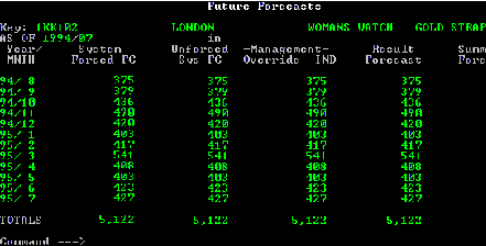
Figure 1
Figure 1 shows a typical text-based emulation screen.
The above example is from an AS/400 business application. The character-based representation is identical to that available on mainframe solutions. We could associate this period with the dark ages. A user interface was seen as a necessary evil, and the specification was guided by what was easiest for the programmer - rather than having much reference to users of such systems. It was not seen as part of an integral solution between man and machine. Anybody who spent any amount of time using these systems realized very soon how limiting they were. At the time however, the use of such systems was still in its infancy. We all used them.
Usability was not a prime concern since computers were seen as "number crunchers". Graphical displays were unheard of; the mass use of Lotus 1-2-3 integrated with business applications was not even contemplated. On-line help when available was limited to screen or menu option detail. Typically on-line help was simply a text-based list of the printed material, perhaps accessed via a key on the keyboard. User manuals were not seen as important in terms of look and feel, and soon earned a reputation as being large, complex and not user-friendly.
Figuratively the employees of the Data Processing department (DP) did not talk with the users. Many systems implementations appeared to the user as ‘painful’ and ‘poorly managed’. A whole school of management evolved to try to cope with these issues. Many people made a living by telling other people how to do the things they ought to know how to do anyway. Other people made a lot of money telling people nothing.
The midrange systems (AS/400) represented an advancement in technology. Old arguments regarding how AS/400 processing power stacked up against the mainframe were, for the best part, soon resolved. Additional technological improvements impacted the user interface, in areas such as multiple sessions and more user-friendly interactive programming. In offices around the world, the MIS (or as they were originally, the DP) people began to sit on the same floor as the user.
Although usability was enhanced with respect to on-line help, pop-up boxes and so on, the overall look and feel was generally unchanged. In many cases one could simply take a mainframe screen, with white text on black screens, and replace it with green text on black.
In general, graphics, color, icons, pictures and other visually expressive tools were not used, available, or even thought of. The whole focus was technology and the benefits thus derived. These were seen purely as overhead from the programmers point of view.
Moving toward the Light
Original releases of Lotus 1-2-3 were green text on a black background, just like a mainframe and AS/400. However, during the early 1980’s the PC began to offer functionality and power of a more focused nature.
An initial strategy for some software suppliers of business applications was to put mainframe and AS/400 functionality on a PC. This recognized some of the power of the PC. Since the PC was already on the side of the accountants’ desk, all this required was a shift in the location of the PC from the accounting office to the operational offices such as sales and marketing.
Business functionality was ported to the PC. In this porting, software developers were able to enhance the interface based on the new features that were to be found on PC’s at that time.
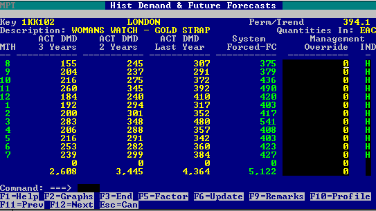
Figure 2
A typical PC-based text-formatted screen from LPW
American Software was an early leader in this field. American Software launched a product called Logistics Planning Workstation, (LPW), which incorporated forecasting and distribution planning solutions. LPW was a leader in what has become known as the ‘supply chain management’ market, with over 800 customers using such systems. These 800 customers included many of the Fortune 1000 businesses and smaller companies who needed solutions to manage inventories throughout their supply chains.
The roots of LPW can be found by incorporating "best of breed" functionality from the then current mainframe solutions together with new ideas that were popular in the market place. LPW initially achieved two things: the porting of mainframe functionality to the desktop and a dramatic improvement in user-friendliness. In the late 1980’s LPW was generally equal to any competitor product in terms of look and feel. In terms of functionality however, LPW was miles ahead of its nearest competitor. The main issue for LPW was the target market. In which market did LPW operate in? Simulation of mainframe processing? Operation of mission-critical business processes? Or a combination of both? The technology to facilitate "big number" processing on a PC had not yet matured. This was to follow.
LPW satisfied the need for powerful "engine room" functionality, but did little for technology-driven sales needing relational databases and GUI.
Technology accelerated and eventually overtook the position that LPW maintained and its competitors sought to attain . Windows, OS/2, UNIX, client/server and others were to open a Pandora’s of box of options. Which to follow? Which will survive? Which will lead the market? As these issues grew in size and complexity, other players entered this mini-size market. Downsizing was pregnant - but had not been born. LPW spawned a whole market of desktop business applications. In principle, a whole business could run its operations on a PC.
However, the PC was not utilizing the vast data warehouse that resided on the mainframe or AS/400. UNIX, or more precisely, Client/Server technology was the answer to exploiting PC based power and enterprise-level business data. However, the enterprise systems were still employing textual based screens with little color, and the PC market was into color, and Microsoft Windows was the early leader. Lotus 1-2-3 spawned into Excel and SuperCalc market segments. Microsoft’s Office suite of products followed some time later.
Light at the End of the Tunnel
In 1993, an exciting endeavor was initiated in the UK. Early seeds were sown that brought together the power of the LPW product together with the popular Windows interface. "Executive Planning Workstation" (XPW) was born. XPW was the first prototype that envisaged altering that way people interact with computers. As XPW was being pioneered in the UK, another development program in the USA was conceiving a similar solution, called Supply Chain Planning.
The foundations on which XPW were built were simple yet hugely difficult to achieve. The current Microsoft Windows release at this time was the new version 3.1. Many applications were marketed as operating on Windows 3.1. However, the Macintosh was a competing system that offered some degree of increased graphical advantages. The "Mac" was more object-oriented and graphical. Windows 3.1 was file-centric and not very intuitive. However, by comparison to the character-based solutions that were available, both were far better than anything ever seen before. Windows became the market, the standard.
The call that brought XPW forth was the need to simplify what users do. Windows systems at this time incorporated pull down menus, combo boxes and radio buttons. Software vendors recognized the market shift and began to retrofit their text-based screens to the PC / Windows environment. Everyone raced to provide an enterprise or business level application on a client/server "windows" environment. Each attempt to meet this new market "need" had met with varying levels of success.
Jumping momentarily to today, SAP is a perfect example of what happens to a mainframe solution (known as R/2) when combined with client/server and while not utilizing the true power of Windows. SAP is today the worlds largest Client/Server Enterprise Resource Planning software developer from Germany. In developing their latest product, R/3, they added a Microsoft Windows interface. SAP developed a client/server architecture and implemented a GUI by following and implementing wholeheartedly the Microsoft Graphical User Interface (GUI) standards. This GUI development was achieved with the thoroughness usually attributed to the German people. The interface fits the standards perfectly, without any variation or violation.
As a result, while including all the business information one needs to do a particular job, is probably the most boring windows interface ever devised by man! XPW’s goal to provide the most intuitive interface for people to manage their business activity as efficiently as possible. The design guidelines for R/3 did not include the user as a critical component of the system.
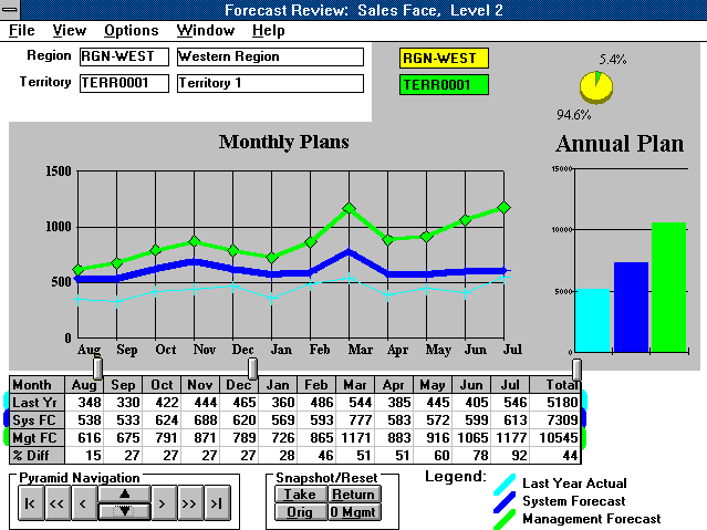
Figure 3
XPW included the idea of "point and click" or "drag and drop" data manipulation
The birth of an "Intuitive Management Control"
The first prototype to be called XPW included the ability to "drag and drop" a business forecast. This was achieved in February of 1993. Prior to this development, forecast overrides the world over were achieved by keying desired changes on the keyboard. In fact, ALL data maintenance in this time was keyboard-driven. Windows only simplified some basic activities that ‘surrounded’ the real work of the day. For example, the mouse is used to find files, open files, and move files. To actually add an order to an order management system, you used a keyboard. The concept of adding characteristics to a product on screen by dragging such characteristics with a mouse had not yet been thought of. However, back in early 1993 these were being thought of and being demonstrated in XPW.
The concept of XPW was more than just dragging a forecast with a mouse. XPW was meant to represent a re-engineering of the planning process. The paradigm shift for XPW, as a visionary product, was meant to be as far advanced from LPW as Continuous Replenishment and DRP was from the infamous Re-Order Point in the 1970’s! XPW heralded a shift in user interface design.
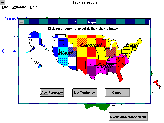
Figure 4
XPW was intuitive, using graphics and colors to detail information
This example shows a "pop-up" map overlaying another map.
As already stated, American Software pioneered the supply chain management market with LPW. By combining LPW and XPW, American Software decided to move into a segment of the market that was to revolutionize not just supply chain management, but also the whole user interface design process for all business applications. The impact and importance of this "intuitive" interface design is what will shape all future interfaces for all applications, from the lowly spreadsheet to the enterprise level information systems.
Supply Chain Planning (SCP) is American Software’s latest client/server RDBMS supply chain solution. More than this, SCP has redefined the standards by which the user interface will be judged. What is so fascinating about this whole story is that those in the market who are analyzing GUI designs are totally unaware of the market shift that is, right this minute, beginning to shape the next few years.
A New Chapter in the Making...from birth to maturity
SCP exploits EGUITM, or Enhanced-Graphical User Interface. So what is E-GUI?
As previously stated, the majority of windows based applications today use many ‘first generation’ features such as scroll bars, radio buttons, and pull down or combo boxes. These were extremely popular when windows was new. Today, they portray a poor use of technology in interface design. They represent an unimaginative way to present data and the decision making process. They are boring.
Looking back at the SAP example described above, there was nothing more boring than having to key in a whole load of numbers. Today, with R/3, you can use the mouse to navigate through several menu trees, but the user still has to maintain the data with the keyboard. Boring.
The market abounds with other examples of software vendors operating on the fringe of E-GUI. For example, in some modeling packages users can drag and drop objects. Very intuitive, of course. But what these vendors don’t understand is that this power and flexibility needs to be employed and exploited within operational and decision support packages. Other products that exhibit E-GUI tendencies are Quicken and, to some extent, Lotus Organizer.
However, E-GUI is not a product. It is a concept.
E-GUI is all about devising the most intuitive interface so that a user never has to refer to a help manual or user guide. E-GUI is all about the use of graphics, colors, sound, icons, and pictures, to more effectively communicate meaning. It is a well known fact that pictures are a more effective medium for communicating a message. So why do we force users to look at rows and rows of text?
E-GUI is all about "intuitive management control". It is all about ensuring that, whatever activity the user undertakes, they can achieve their task in the shortest amount of time with the least effort. The whole process and activity will be an enjoyable one. It will not be a game, but it will not bore the user. If it bores the user, they will not do the job as effectively as they could.
Definition of E-GUI - How to measure "Intuitive Management Control"
In determining whether an application utilizes E-GUI, we have to take account of several design criteria. Some of these criteria include:
E-GUI: Configurability
Configurability is about putting into the hands of the user the ability to define their working environment, an example of which is the PC-Desktop. The Macintosh introduced some great configurability. Windows 95 today offers the most configurability on the market. Configurability means that the whole presentation and structure of the desktop and associated views are controlled and managed by the user.
In the arena of configurability, the designer’s challenge is to make it easy and intuitive for users to improve their environment, but not provide so many features, bells and whistles, that software becomes ‘bloatware’. Users need to be provided with the tools they need so they can find the area of the system they need for their work quickly and efficiently.
The evolution of the ‘main menu’ is a classic example of people employing configurability in their designs. Menu’s themselves have fallen out of favor because of the implied use of nested menus - menus that reside underneath other menus, and so on. Today, a highly configurable menu solution includes ‘Navigators’, windows that bring to the same view all the necessary sub menus that are needed to perform a particular task. In fact, ‘task oriented navigators’ is what today is replacing old fashioned menu systems.
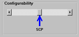
However, configurability is one component of a great user interface. SCP certainly has much to say about configurability as the leader in its market, and greater things will follow. Today SCP fits somewhere in the middle of the scale. Too much configurability means that users spend too much time building windows and views and less time on real work.
E-GUI: Conformance
For most of us who work in the real world, Microsoft has taken control of the definition of user interface standards. They have achieved this by making Windows 3.x, and then Windows 95, the standard operating system that most of us use, and by making their Office suite of products the most popular in the world.
This has been good for the industry and good for us users, since they have generally done an excellent job of defining how Windows programs should look and work. For the most part, their products conform to their own standards and are internally consistent.
Conformity is another way that software products can be measured and compared. Even though Microsoft has done a great job of publicizing its standards, there are still too many software designers who choose to ignore convention and go their own way, mostly with unfortunate results. This is not to say that a piece of software is automatically bad because it violates a rule defined by Microsoft; rather, as users, we tend to become confused and frustrated when a designer obviously has not studied Microsoft’s guidelines and feels they must invent their own rules. It is rare that these new rules improve upon the ones developed by Microsoft through years of usability testing.
The lesson here is that a designer must study and thoroughly understand Microsoft’s guidelines before thinking about violating or extending them.
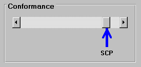
Conformance is critical when selecting multiple desktop solutions from different vendors. SCP clearly meets all the critical and most less critical areas for conformance, without loosing flexibility in the remaining measures of E-GUI.
E-GUI: Consistency
We can also evaluate software on internal consistency. Although Microsoft has defined what controls are available to a designer and how they should be used, this still leaves much latitude in the construction of the user interface. Conformity (above) measures how well a software product matches Microsoft’s standards. Consistency measures how well the product matches itself.
Are the same controls and objects used the same way throughout the product? Is the use of color consistent? Are the components within the windows arranged the same way? Is terminology consistent? Have the same conventions been used for all the help topics? In short, does the product look like it was designed by one person at one time following a specific style guide, or does it appear that it grew over time, built by different people with differing goals, incompatible tastes and conflicting opinions about what constitutes good design? The best software acknowledges Microsoft guidelines, violates those guidelines where appropriate, and is fully internally consistent.
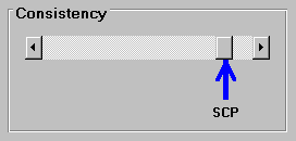
Again, SCP clearly satisfies this component of E-GUI measurability.
E-GUI: Coolness
Software can follow the Microsoft guidelines to the smallest detail, be 100% internally consistent, and still be bad. There are multiple ways to achieve this. The most popular way is by being boring. Unimaginative designers who do not understand what their users are trying to accomplish typically build clunky, ugly, confusing interfaces. A creative designer who truly understands the task the user is doing can create an application that looks attractive and is fun to use. While business software may never achieve the level of user engagement that an arcade game reaches, good design can fully engage the user and make him/her more productive and produce more accurate results in less time and with less boredom. Is it still work if you enjoy it?
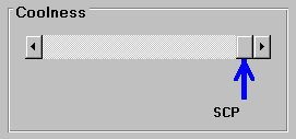
This is the measure that, of itself, differentiates SCP from the rest of its competitors. SCP employees more leading edge visual design precepts than any other solution available today. SCP has more cool GUI than any other. SCP is setting the standards for where GUI is going.
So what are these precepts that guide a designer when they want to excel at E-GUI? Within the design team at American Software, the GUI designers utilized several key precepts, as shown below:
In this sense, taction is another dimension to the four E-GUI benchmarks described above. With these precepts in place it is easy to see why SCP has a unique advantage in its market today. Users that were bored and used to the old way of manipulating un-intuitive screens can now operate at a high level of simplicity. More can be achieved with less. Training is reduced. Effectiveness in increased. Objects that relate to the real world (natural objects) are now communicate more effectively than engineered objects, and far more effectively than text and words.
E-GUI by another name…and we did not even know it
In the commercial market we have already seen how taction has proven to be marketable and profitable. In the PC games market, DOOM (from id Software) was a game that basically exploded on the scene one quiet summers day back in 1993. DOOM is a first person "shoot ‘em up". You play the part of soldier in a simple maze, whereby you move around trying to proceed to subsequent levels, simply killing monsters as you go. There had been other games of this type on the market for years, but nothing like DOOM.
DOOM had superior graphics. DOOM modeled and ray traced the actual lighting that a person would experience if they were "there". DOOM more closely represented, on the PC, what you and I would have actually experienced if we had been inside the game. The game-play itself was also superior to anything in the market. Highly intense, to survive the player has to be "on their toes" all the time. Accordingly, DOOM qualifies as a high taction activity. Speaking as a DOOM freak, I know how addictive it became. I lost many hours sleep playing this game. I would arrive home from work some evenings at 6pm, turn on the PC, and play until my sore eyes gave up at 2am! And this was for many consecutive evenings. DOOM was a disease that could not be cured until the player had finished the whole maze.
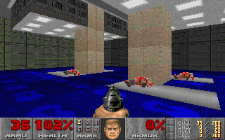
Figure 5
Doom - Play the part of a sergeant and kill monsters and other bad guys all you want.
Copyright id Software
DOOM itself today is 3 years old, and yet every game that tries to invade this space is compared to this original. It is very rare that a PC game ever remains on the scene for any amount of time. DOOM takes all records. It spawned many subsequent seed games, such as DOOM2, Heretic, Hexen and so on. Many other companies have tried to duplicate the success achieved by DOOM. None have done it. DOOM is a winner in its market.
The elements for success used by id software, the makers of DOOM, are clear. The interface had the highest quality interface possible with the given technology. In fact the interface design advanced that technology. The intensity of the game play was the other major success factor. QED. Playing DOOM was a high taction activity.
Final thoughts on E-GUI…and some examples
Supply Chain Planning is bringing high taction to an area that traditionally would never have been considered worthwhile for taction of any level. Business application users are used to being bored. They are used to looking at screens with white backgrounds screens with radio buttons everywhere. They are used to a screen that has no bearing to the real world. In fact they live in two worlds - the one home and a different one at work that shares not common look and feel as that at home.
What E-GUI is trying to do is make working easier. More efficient. More intuitive. Data and files are not the real world focus. Products and customers are. Products and customers should be what people see on their screens.
The mouse is a far more efficient mode of communication than the keyboard when the objects underneath the mouse are more meaningful. In fact, the mouse itself probably has a limited life span already. Advances in neural technologies may soon surpass the pointing device in terms of effective communication with the computer. E-GUI is all about exploiting technologies that are available today to a more effective level.
What is unknown is how far can this technology evolve, and how this little revolution will impact all other business applications on the market. For example, imagine R/3 employing E-GUI?
Users of Supply Chain Planning now make intuitive changes to their business forecast with the aid of the mouse. Changes to budgets, prices and costs are also made via the mouse. The principle now being deployed by E-GUI is that ALL data and information should be managed via the mouse. Setting up product categories, managing orders, managing the setting of polices are all happening now via E-GUI.
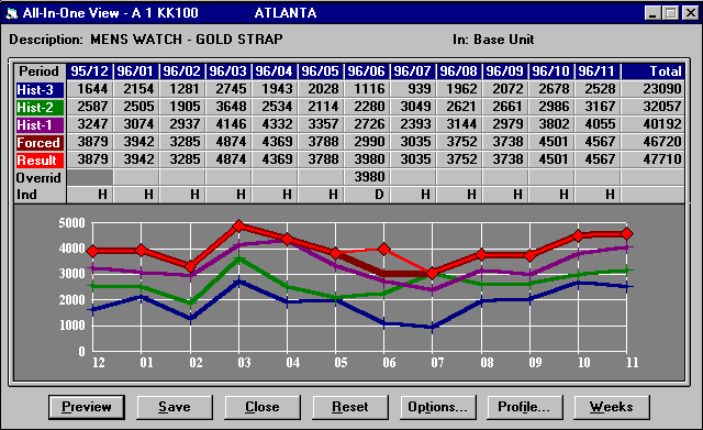
Figure 6
SCP forecasts are manipulated via the mouse
E-GUI adds value to current business process, in order to make them more intuitive and simple to use. In principle, wherever a user used to wait for an event to be modeled by executing a button initiated event, they can now "drag and drop" the characteristics or decision onto another object, and now simulate changes to the business before making final decisions. A good example here is in forecast modeling.
Some forecasting applications can model the demand profile for a firms products. In this modeling process, curves are assigned to each product. In this sense, each product may have a seasonal forecast, or perhaps a non-seasonal forecast. There are clearly many other curves and shapes that can be applied. Traditionally, grouping items together to improve forecast processes used to be a time-consuming process. Some application packages try to automate this, as did IBM’s Inforem product.
This product was able to take huge volumes of data and statistically analyze the demand patterns of each item, and then produce certain curves that groups of items could be associated to.
Today, E-GUI can enhance this activity today with re-engineering it. Imagine a window whereby you can view graphical representations of single and grouped items curves. Simply dragging one item to the group would cause the window to simulate the addition on the item to the group, graphically. To aid the user who might be trying to establish a relationship between items and groups of items, a measure of correlation may be employed. The point here is that already we have black box solutions to real business needs. E-GUI can provide a way to "turn the light on" and deliver a more intuitive way to make decision. E-GUI provides for "Intuitive Management Control".
E-GUI also provides for a most effective vehicle to re-engineer business process completely. For example, with the focus being customers and products or services, how better then to represent these as objects within the screen.
But don’t forget, E-GUI also includes color, pictures and sound. Already there are movements in the market place to add sound and color to communicate on several levels activity and management interaction. Using colors for status is a traditional use for color. However, status is actually used in many cases, and color can help assist to communicate such changes more easily.

Figure 7.
Color and sound signify changes in planned loads within the supply chain planning process. Green communicates a user configurable load acceptance criteria being met, and a red (with associated sound) would signify failure to meet criteria.
Conclusion
As E-GUI moves forward and evolves further, we will see a shift in all other interface designs to incorporate more "intuitive management control. Soon, application vendor packages will be assessed on the amount of object orientation employed on the screen. Imagine the following criteria for the selection of a user interface for an enterprise system:
Windows 95 has certainly advanced the case for a more effective and pleasing user interface. Windows 95 shifts the focus from directories and files to objects, such as projects. In Windows 95, for example, several Word documents may share some graphics in a PowerPoint, together with an Excel Spreadsheet. All the documents may be located in a folder that resides on your desktop. Just like in the real world!
As the use of objects increases we shall also see a new trend toward natural objects. What this means is that the objects that are being used on our desktops will not be pristine, perfectly engineered graphics. As in the real world, the metaphor will , eventually, be focused on a natural form of graphic. For example, a trash can is used in Lotus Organizer for the user to "drag and drop" data to. The trash can is in fact a waste paper basket. In some other systems, perfectly designed and perfect trash cans are used to simulate a similar deletion process. No one has a perfectly designed ‘perfect’ trash can in their back yard. Trash cans are dirty, damaged, bent and real. E-GUI supports the natural look, not the engineers’ look. Microsoft Bob was one such neat idea that was, in terms of its user interface design, ahead of its time. Doom employs a substitute natural interface - one that is so good that it is believable. The natural interface will become the norm.
Looking to the future the impact of E-GUI will be far reaching. The desktop will become the medium by which we shall communicate. It may change in size and shape. It may become more portable, and be integrated more at home with other electronic devices. The desktop will be the focus. The technology behind it will become more and more transparent to the user. What will gain in importance will be what is on the desktop.
Bill Gates certainly changed the face of the world with Microsoft Windows. With Windows 95 the user interface has taken greater bounds forward. E-GUI is certainly an unspoken goal at Microsoft. But this is only the beginning. As Churchill said in referring to the Battle of France in the Second World War: "This is not merely the end of the battle. Nor is it the beginning, but rather the beginning of the end."